Writing a great resume takes your carefully crafted words and elevates them with an eye-catching design that represents your style. But what exactly does a stellar resume look like? The simple answer is: streamlined and professional without being boring.
But where is the line between professional and boring and how can you distinguish yourself within a tight framework?
The ideas and explanations below break down each important component of a good resume and offer tips for making the most of them in your layout.
In this blog, we’ll cover:
- Why the visuals are so important
- Projecting the right image
- The best fonts for your header, section titles and text
- Deciding on margin size
- How to leave enough white space
- To add color or not?
- Should you use photos or graphics?
Why the visuals are so important
Why spend time thinking about what your resume should look like instead of focusing on the content? The way a resume looks contributes to the message it sends to recruiters. Using the visual elements of a document to your advantage enhances your entire application.
Think about what you notice first when you open a new web page or meet a new person. Much more quickly than you can process language, you’ve already decided based on looks. Recruiters are no different. That carefully cultivated skills list won’t matter if they can’t find it within a few seconds.
Developing a cohesive yet eye-catching image throughout your resume is even more important if you are in any kind of creative field, or even an adjacent one.
Let’s get started with the foundation for the look of your resume: the format.
How to choose the right format
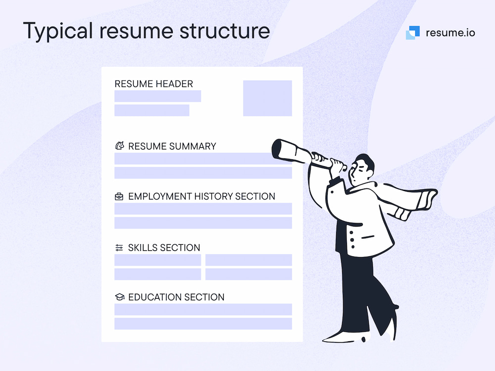
The format of a resume determines how the elements will be placed and where the emphasis will lie. There isn’t one “correct” format, but where you are in your career and the move you want to make will help you choose which is best for you.
| Format | Best Use |
| Reverse chronological order | To highlight career progression for all who have had a relatively straightforward career path |
| Functional | To emphasize skills and education over work history |
| Hybrid | To create a balance between skills and work history |
Projecting the right image
What a resume should look like depends on the image you are trying to project. Yes, it should be professional, but beyond that, the look of a resume should align with the personality traits you have touted in your summary, work history, and skills sections.
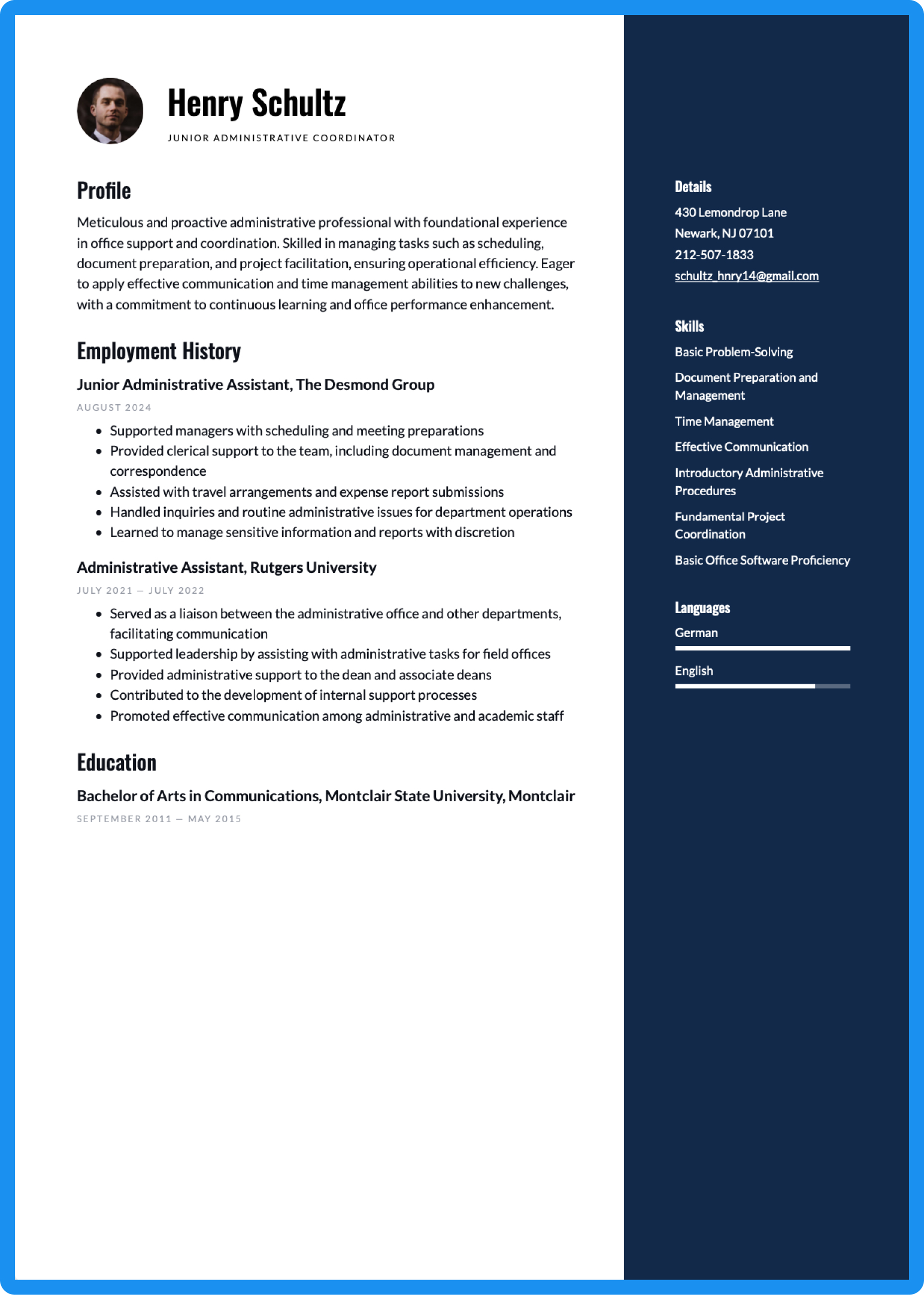
For example, a resume for an accountant focuses on attention to detail, trustworthiness, and organization. That document should tend more toward visually conservative. Our accountant example resume uses the monochrome Amsterdam template from our modern category.
A resume for a graphic designer, however, should showcase creativity and unique thinking. Our graphic designer resume example makes use of color through our Dublin template.
Here are a few questions to ponder as you make design choices:
- What is the main message of my resume?
- What are three adjectives that describe my work style?
- What are three attributes from the job listing that I should convey in my resume?
Color is just one of many choices available when creating the look of your resume. The details below and the design decisions you make about them all contribute to the overall image your resume portrays.
The best fonts for your header, section titles, and text
Fonts, or typefaces, are the backbone of your design. Every step of the way, in all your design decisions, your first consideration should be: Is it easily readable? The best resume fonts are clean with neat lines. They lack frills such as curls and are not highly stylized.
Fonts are design elements, but they are also image makers. Consumer brands, company logos, informational materials, advertising and marketing campaigns—anywhere there are words and letters, careful consideration has been made about which fonts to use and how best to combine bold, italic, and thin versions of font families.
If you want to make sure your resume design is clear and effective, try a resume rater to get feedback on your layout and formatting.
Your first decision is whether to choose a serif or sans serif type. This blog has a sans-serif title and a serif body type. Mixing these two types is an option, one for your name and section titles and one for the body, but be sure to choose fonts that pair well.
A classic example of a serif type is Times New Roman, originally designed for newspapers. While some avoid this older font because it is the default for many, others like it for its powerful feel and legibility. Garamond is a serif alternative. Among sans serif fonts, Calibri, the Microsoft default, is a clean choice. Helvetica is widely used and regarded as a font that does not detract from content.
| Serif | Sans serif |
|
|
Your name should be the largest type on the page, somewhere between 20-24 pt. Next in the hierarchy are your section headings at 11-14 pt and then your contact information and body type at 10-12 pt. We suggest staying larger than 10 pt. for your text to keep it legible and avoid a crammed-in look.
Deciding on margin size
Trying to keep all the accomplishments of your career on one page can be tough, but shrinking your margins is not the way to go. Word docs defaults to one-inch margins all around, but you’re not creating a Word doc so you have some leeway.
Depending on the design of your resume, these margins may not make much sense. Take a look at our Toronto modern resume template. It uses accent boxes to separate sections and create a visually spacious feel with tighter margins.
While we’re not suggesting that you push your text out to the edges of the page, we are saying that a visually impressive resume may not have standard one-inch margins. However, if you decide to use a resume template, avoid changing the margins within the design to more than a quarter inch or you risk losing the white space designed for legibility and aesthetics.
Think again of the image you want to project. While you want recruiters to know that you have plenty of skills and experience to share, you know how to communicate in an organized, efficient manner. You can deliver your message while taking time management into account.
How to leave enough white space
White space gives your reader some breathing room. Large blocks of margin-to-margin type invite the reader to move on—they are difficult to read and strain the eye. It also gives the appearance of disorganization, like a desk piled high with incomplete work.
White space or negative space also serves to separate your sections so they are easier for HR to find during a quick scan. It’s likely they’ll want to peruse your skills and view your most recent accomplishments first. Leaving white space around each section concentrates the focus where you want it.
Follow these design principles to ensure you leave the impression of an organized, clear communicator:
- Use white space between sections, paragraphs, and lines of type
- Spacing between lines should be at least 130% greater than the font size
- Create “closed” areas that mimic shapes. They draw the eye in
- Be consistent. In other words, use the same amount of spacing between the same types of elements
- Vary your line lengths to achieve negative space within your sections, especially your work history block, which can become dense with all your achievements!
Follow the eye
In a document such as a resume that contains a lot of text, the reader’s eye tends to follow the “F” pattern.
First, the reader gravitates toward the top, left to right. Next, they scan down the left side. When they find what they are looking for, for instance, a section heading, they read left to right and then repeat the process looking for the next bit of interesting information.
Keep this pattern in mind as you design.
To add color or not?
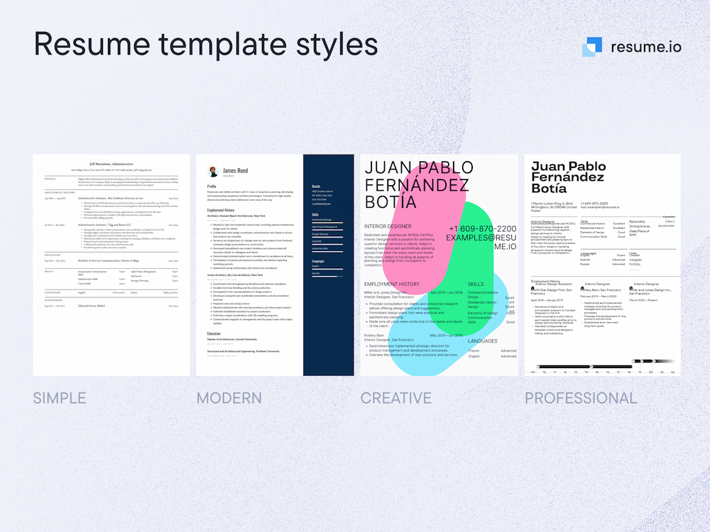
Should you add a splash of color to your resume layout? The short answer is maybe. There’s no one perfect resume style and there’s no one perfect answer to this question. Why? Several factors will influence your decision, most importantly the impression you’re aiming for.
Let’s go back to the accountant vs. the graphic designer resume comparison. Accountants spend their days with spreadsheets and numbers. They’re not paid to be creative with the finances. Sticking with a white background and black type conveys that they take the responsibility of safeguarding the money seriously. Graphic designers, however, are paid to use color (and all the other elements discussed in this blog) to the advantage of the project. A lack of color might have recruiters scratching their heads.
Another consideration is how your document will be viewed. It’s very rare to send paper resumes through snail mail, but you may print them out to bring with you to the interview that you will surely get with your excellent resume! If you can control how the color will look to the reader, go ahead, but make sure there’s high contrast between the text color and the background.
Finally, your resume should mimic the culture of the company. Is it an old-fashioned standard bearer in the industry or a scrappy startup?
Choosing the right color for your resume
Which color is right for your resume? In short, choose the hue that matches your professional style.
Colors elicit different emotions, sending different messages. Generally speaking, most experts agree that these colors correspond to the following meanings:
| Color | The message it sends |
| Red | Energy, determination, passion |
| Orange | Ambition, vitality |
| Yellow | Optimism |
| Green | Growth |
| Blue | Calm, trust, loyalty |
| Purple | Creativity, focus |
| Brown | Strength, stability |
If you want to add color, but you’re stuck choosing the right one, here’s one idea. The colors in the company’s logo reflect its image, so when in doubt, copy their colors.
Should you use photos or graphics?
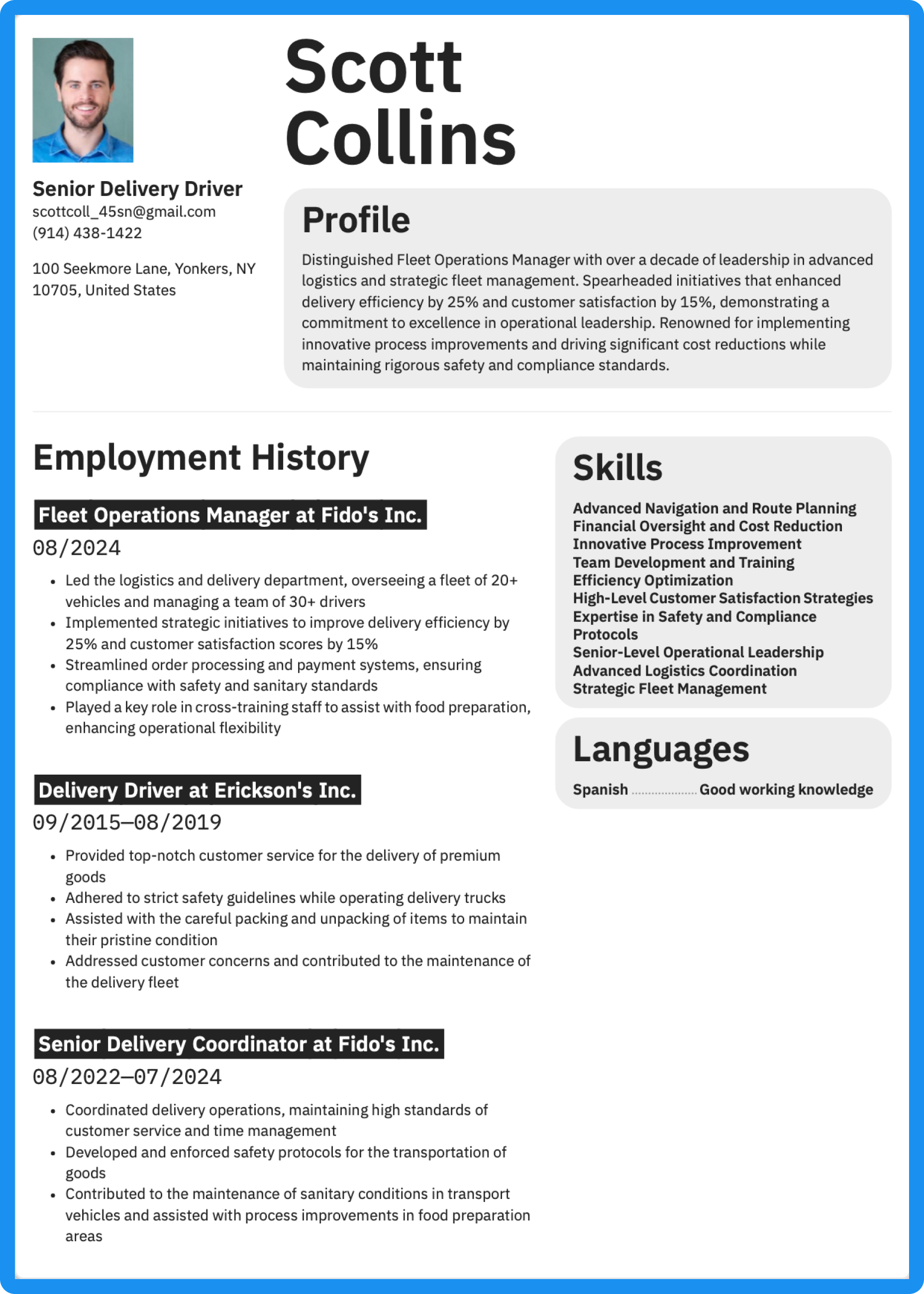
One last question on your resume’s appearance is whether or not to include images. We have one almost definitive answer for you: Do not use photos, especially of yourself, unless you’re an actor or other visual performer. They make HR people squeamish because they could create the appearance of bias.
Graphic elements are another matter. Small icons representing the different categories can add a bit of flair to an otherwise traditional resume when used appropriately, by which we mean in small doses. Choose wisely or these icons may lend an air of immaturity or frivolity that undermines your professionalism.
Our New York template incorporates small icons that cue the eye to each resume section. If you go this route, it's best to avoid also using color. Too many different design elements can be confusing or make your resume look cluttered.
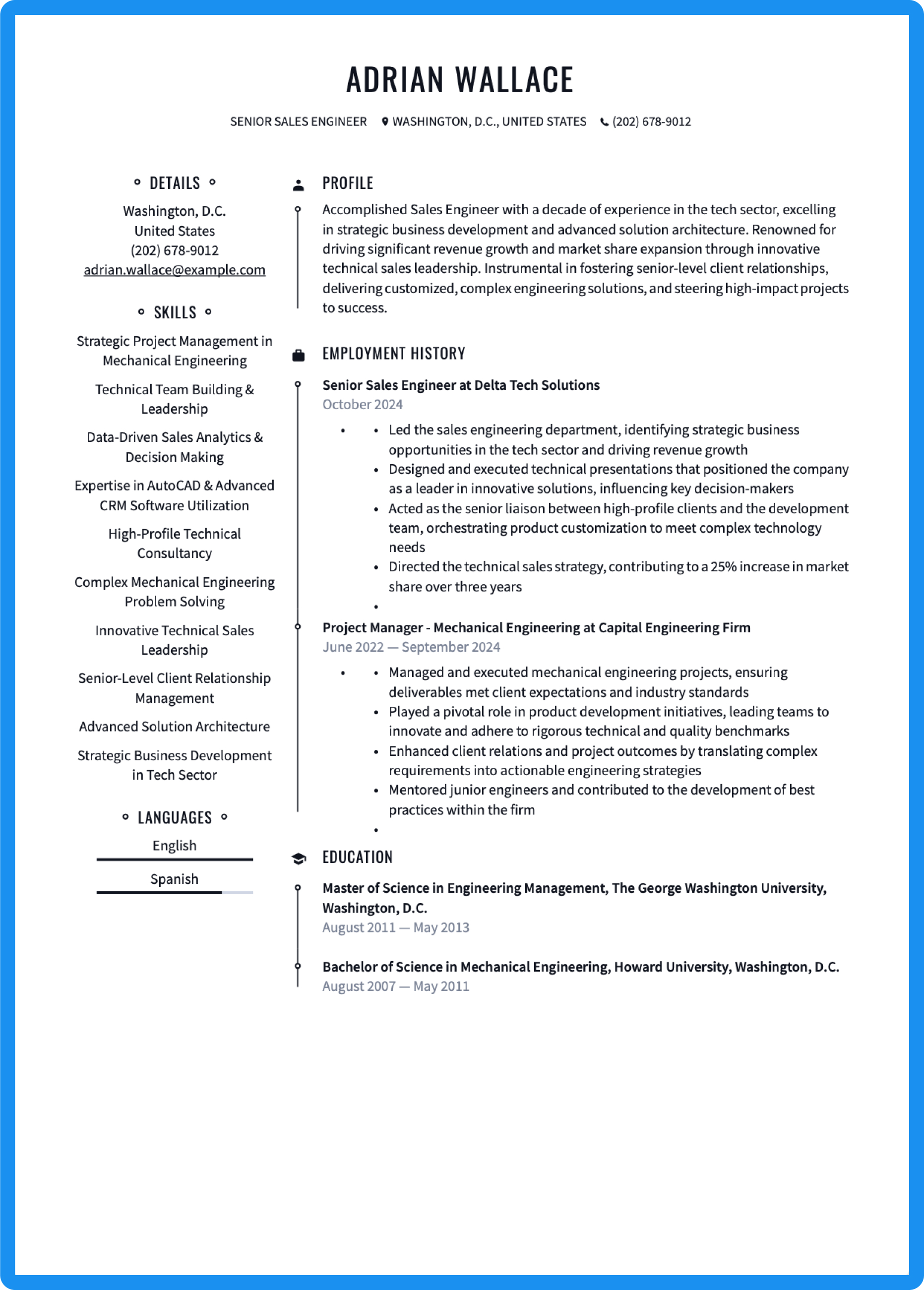
View resume templates with a picture.
One final tip: A graphic resume may seem like just the thing to garner attention, but be aware that they are not ATS friendly (for more on applicant tracking systems, read our blog on resume ATS optimization) since they are not easily scanned into a standard online format and can make the reader’s life more difficult. While you want to stand out, you don’t want to create any barriers the recruiter is unlikely to try to leap.
Key takeaways for how a resume should look
What does the perfect resume look like? That all depends on the job you want, the image you are trying to convey, and the culture of the company where you want to work. A resume crafted with intention will be eye-catching and make a compelling first impression. Keep the following principles in mind: clarity, images, and readability and you’ll be well on your way to a great resume and your next job.
Get a head start with our resume builder and one of our many customizable resume templates.


