


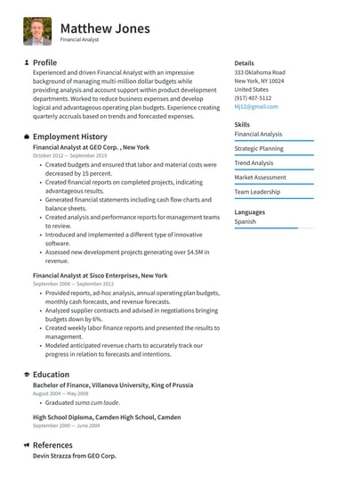
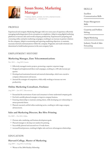
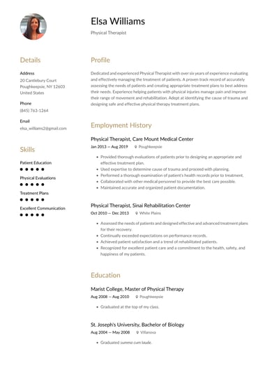
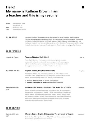

TLDR: minimalist resume templates
- A minimalist resume strips out color, graphics, and decoration so your experience is the only thing competing for attention on the page.
- The defining features are generous white space, one clean font, plain section headings, and a narrow palette, most often black, white, and grey.
- Because they carry no graphics, tables, or skill bars, minimalist layouts are among the safest for applicant tracking systems to read.
- Skill rating bars and decorative icons are not minimalist, whatever a template gallery calls them, and both can cause parsing problems.
- Resume.io's minimalist templates are free to download in Word, PDF, or Google Docs.
How do you make a minimalist resume?
Making a minimalist resume is mostly a process of removing things rather than adding them, which is why it takes less time than people expect.
Settle your font, margins, and palette before you write a word, then let the structure stay out of the way while your achievements carry the page.
- Start from a single-column layout, either a blank document or a minimalist template with the spacing already set.
- Set margins at 0.75 to 1 inch on all sides, which gives you the white space the whole look depends on.
- Choose one clean font and stay with it throughout, using Arial, Calibri, Helvetica, or a restrained serif such as Cambria.
- Build hierarchy with size and weight alone, so your name sits at roughly 22 to 24 point, headings at 14 point, and body text at 10 to 12 point.
- Keep body text black or dark grey, with at most one restrained accent used only on headings or a thin divider rule.
- Use plain section headings, and separate sections with white space or a single thin line rather than boxes or shading.
- Write every bullet as an achievement with a number attached, pulling the keywords from the job description as you go.
- Export as a PDF to lock the spacing in place, keeping a Word version for applications that ask for an editable file.
The rule worth repeating is that minimalist is a discipline rather than a style you bolt on.
Each time you are tempted to add an icon, a photo, a colored block, or a skill rating bar, the minimalist answer is to leave it out and give the space back to your experience.
Whether you build it by hand or start from one of our online resume templates, the discipline is the same.
What does a minimalist resume look like?
A minimalist resume is a single column of plain text with wide margins, clear headings, and nothing decorative between the sections.
Here is the structure, followed by a worked example.
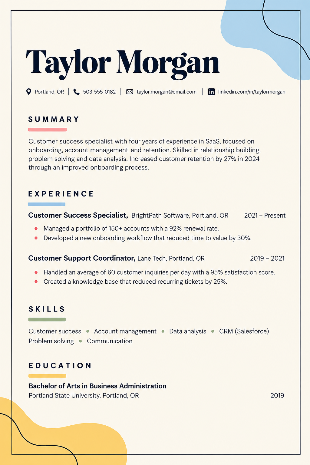
The formatting behind it is deliberately unremarkable: 0.75 inch margins, Calibri throughout, the name at 24 point, headings at 14 point, body at 11 point, and one thin rule beneath the contact line.
There is no photo, no icon, and no skill bar anywhere, which is precisely why it reads as confident rather than empty.
Keeping it to one page suits the format, and you can see the same restraint applied across other careers in our resume examples.
What are the best minimalist resume color palettes?
The strongest minimalist palettes are close to monochrome, which is why black and white has never stopped being the default.
A narrow palette keeps attention on your content, prints reliably, and never dates, and recruiters consistently recommend it when your resume is likely to be screened by software before a person sees it.
| Palette | How it reads | Best suited to |
|---|---|---|
| Black and white | Classic, confident, highest contrast | Finance, law, consulting, academia, any ATS-screened application |
| White and grey | Softer than pure black, still restrained | Corporate, tech, healthcare, most office roles |
| White and beige | Warmer, slightly editorial | Communications, education, non-profit |
| One accent color | Quietly distinctive, still clean | Marketing, design, and resumes sent directly to a person |
When the role is uncertain, black and white is the safe answer.
Use an accent color only on headings or a divider rule and never behind blocks of text, since colored shading is harder to read on screen and can interfere with parsing.
If you want a similar restraint with a slightly more contemporary feel, our modern templates follow the same principle with a little more styling.
Where can you download a minimalist resume template in Word, PDF, or Google Docs?
Resume.io's minimalist templates are free to download, and you can take yours as a PDF, a Word file, or a Google Docs document depending on what the application asks for.
Choose a template, replace the placeholder content with your own experience, and export the format you need.
PDF is the sensible default here, because it fixes your spacing and typography exactly as you set them, and spacing matters more on a minimalist resume than on any other kind.
It is worth knowing that free design-platform templates often compensate for their decoration by shrinking body text to fit, and premium designs frequently require a paid account before you can edit them again later.
A template built for a resume rather than a design portfolio avoids both problems, and every one of our templates downloads free in all three formats.
What makes a resume minimalist?
A resume is minimalist when every element on the page carries information and nothing is there for decoration.
In practice that comes down to four things: generous white space, a single clean typeface, a narrow palette, and section headings that are plain rather than styled.
- White space is the defining feature rather than a byproduct, so margins stay wide and sections are separated by space instead of boxes or shading.
- Typography does the hierarchy work, with size and weight marking the difference between your name, your headings, and your body text.
- The palette stays narrow, usually dark text on white, with at most one accent used sparingly.
- The content is edited as hard as the design, so older roles are trimmed and anything irrelevant to the target job is cut entirely.
It is worth being blunt about something most template galleries are not.
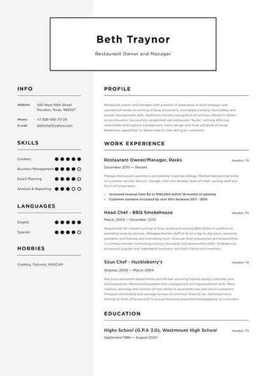
Skill rating bars, decorative icons, timelines, and photos are routinely sold as part of minimalist designs, and none of them are minimalist.
They add visual noise without adding information, a rating bar tells a recruiter nothing meaningful about your actual proficiency, and all of them risk being misread by screening software.
If you want a layout that looks designed while staying parser-safe, a two-column template built with native columns is a better route than a minimalist template with graphics bolted on.
Who should use a minimalist resume?
A minimalist resume suits almost everyone, and it is the obvious choice wherever substance is expected to speak for itself.
- Traditional professions: Finance, law, consulting, and academia all favor restrained documents, where anything decorative reads as a distraction rather than a differentiator.
- Technical and clinical fields: Roles in engineering and healthcare are judged on credentials and measurable results, both of which a clean layout puts front and center.
- Education: A teaching resume benefits from being easy to scan, since hiring panels often review a large stack in a short window.
- Senior candidates: A layout that does not compete with your track record lets years of experience carry the page on their own.
- Students and recent graduates: Students get a clean frame that makes a shorter history look deliberate rather than thin.
The caveat
A minimalist layout exposes weak content immediately, because there is no design for vague bullet points to hide behind.
If your achievements are specific and quantified, that works entirely in your favor.
If they are not yet, strengthen the writing rather than adding decoration, and customize the resume to each role so the limited space is spent on what that employer actually asked for.
The format is a weaker fit only where visual work is itself the qualification, such as graphic design or illustration, where a portfolio-style document is expected.
Even then, many designers submit a minimalist resume alongside a separate portfolio, which is usually the safer combination.
Are minimalist resumes ATS-friendly?
Yes, and they are among the most reliable layouts you can choose.
A single column of plain text with standard headings and no graphics is close to the ideal input for screening software, which reads the page from top to bottom and reconstructs your sections from what it finds.
Nothing in a true minimalist design gets in the way of that.
The exception is a template sold as minimalist that still carries skill bars, icons, tables, or a sidebar, since those are the elements that actually cause parsing failures.
Keep standard headings such as "Work experience" and "Education", avoid images entirely, and match the format to your history before you worry about the styling.
Our guide to building an ATS-friendly resume covers the rest, and our ATS templates are built single-column for exactly this reason.
What is a minimalist resume?
A minimalist resume is a clean, one-page resume that presents only the essential details of your career, with the design reduced to white space, typography, and a restrained palette.
The term describes the design rather than the content, so a minimalist resume is not a shorter or less detailed one.
It carries the same sections as any other, including your summary, experience, skills, and education, and simply removes everything that does not help a reader find them quickly.
Frequently asked questions
Here are quick answers to common questions about minimalist resumes.
What is the difference between a minimalist and a simple resume template?
The two overlap heavily and the terms are often used interchangeably.
A simple resume template is the classic, no-frills layout, usually grayscale with clear lines separating sections.
A minimalist template takes the same principle further by prioritizing white space and typography, using fewer dividers and an even narrower palette.
Are black and white resume templates a good choice?
Yes, and for most applications they are the strongest choice available.
Black and white gives the highest contrast on screen and in print, never looks dated, and carries no color that could interfere with parsing.
It is the standard expectation in traditional fields, and a safe default anywhere your resume will be screened before a person reads it.
Are minimalist resume templates free to download?
Yes. Resume.io offers free minimalist templates with clean, ATS-safe layouts, and you can also pair one with a matching professional template if you need a slightly more formal version.
Choose a design, add your details, and download it as a PDF or edit it in Word or Google Docs.